Responsive design - Ensuring Your Website Looks Great on All Devices
Did you know that of today's digital intake, 60% comes from the smartphone that you carry with you literally everywhere? You read it when you commute to work, waiting for the kids to come out of the school doors, or then you read it on the screen at your desk, maybe even on your tablet on the couch. This proves that we website designers, need to do a design that easily adjusts to every one of the screen sizes.
What is responsive design?
Responsive design is to enable the content on the website to be dynamically responsive to different screen sizes or devices. Instead of needing to create separate designs for each screen format, which would be a bummer, a designer uses responsive design for the content to be able to automatically adjust its layout, images, and functionality to the format it is viewed on. Responsive design uses flexible grids, fluid images, and media queries to create one site that works everywhere.
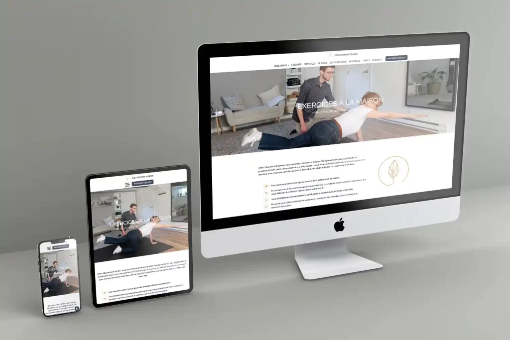
Think of it like water taking the shape of its container—your content flows and reshapes itself to fit perfectly, whether viewed on a 6-inch phone screen, a medium-sized tablet, or a 27-inch monitor.

A photo made with AI to illustrate fluid in different viewports.
Why does Responsive Design Matters
User Experience Comes First
There is nothing more frustrating than when you feel the need to pinch, zoom or scroll horizontally to be able to read the content. A website that is responsive provides an experience that is optimal for the viewer. When the navigation is intuitive, the content can be read easily, no matter what device you are on, the user has a more positive experience, which leads to them staying longer, maybe engaging more and is more likely to convert.
Google likes responsive sites
Google uses "mobile first" indexing, which means that the sites whose mobile version is good have a more likely chance to rank better than the sites that lack a good mobile version.
Cost and time efficiency
Imagine doing updates or any kind of changes on 3 different versions of the same website?
How costly and time-consuming this would be, also frustrating, especially when you know it could be done in just one design and be adjusted to the different screens.

The 4 key principles of responsive design
- Fluid grids and flexible layouts
Instead of using pixels as a measure of the content layout, we use relative units to describe the width, for example, viewport width or a percentage. - Flexible images or other media
An image needs to be flexible inside its container without distorting it. This way it will look good on any device you look at it with. We can adjust the picture size depending on what device you watch it on, this way your computer will be much quicker because it won't show a big version of the image, but a smaller and lighter one. - Media queries
These CSS rules detect the device the website is read on and apply the appropriate styles to it, like screen width, orientation or resolution. One example of this is how your navigation menu transforms from a horizontal bar on the desktop to a hamburger menu on a mobile. - Mobile-first
This is still dividing the website community, if the designing should start with the mobile screen or a larger desktop. For some it is easier to start bigger, and then clam everything onto smaller devices, and for other, it is easier to force to prioritize essential content and features on a smaller size, and after, see it on a bigger size. I prefer the first option!
Responsive Design Breakpoints
The following standard breakpoints cover the most important devices and are the most commonly used.
- Mobile: 320px to 480px
- Tablets: 481px to 768px
- Small Laptops: 769px to 1024px
- Desktops: 1025px to 1200px
- Large screens: 1201px and above
There are so many different viewports, and if you follow each breakpoint, it would be mission impossible and a sure checkmate! This is why some website builders use only 3 breakpoints (mobile, tablet and desktop) and some, like the one I use, have 5 breakpoints. This way, I can decide when the menu turns into a hamburger or when the image is going to become smaller, or at what moment the grid of 3 columns beside each other will become a grid of 3 where the columns now fall one under another.

These are just guidelines to follow, and each website has its own breakpoints that fit the design. You let your content decide where your content layout breaks.
Responsive design isn't a trend-it's the standard. With users accessing websites from an ever-expanding array of devices, ensuring your site looks great and functions perfectly everywhere is non-negotiable.