Colors & Color palettes


The importance of color balance
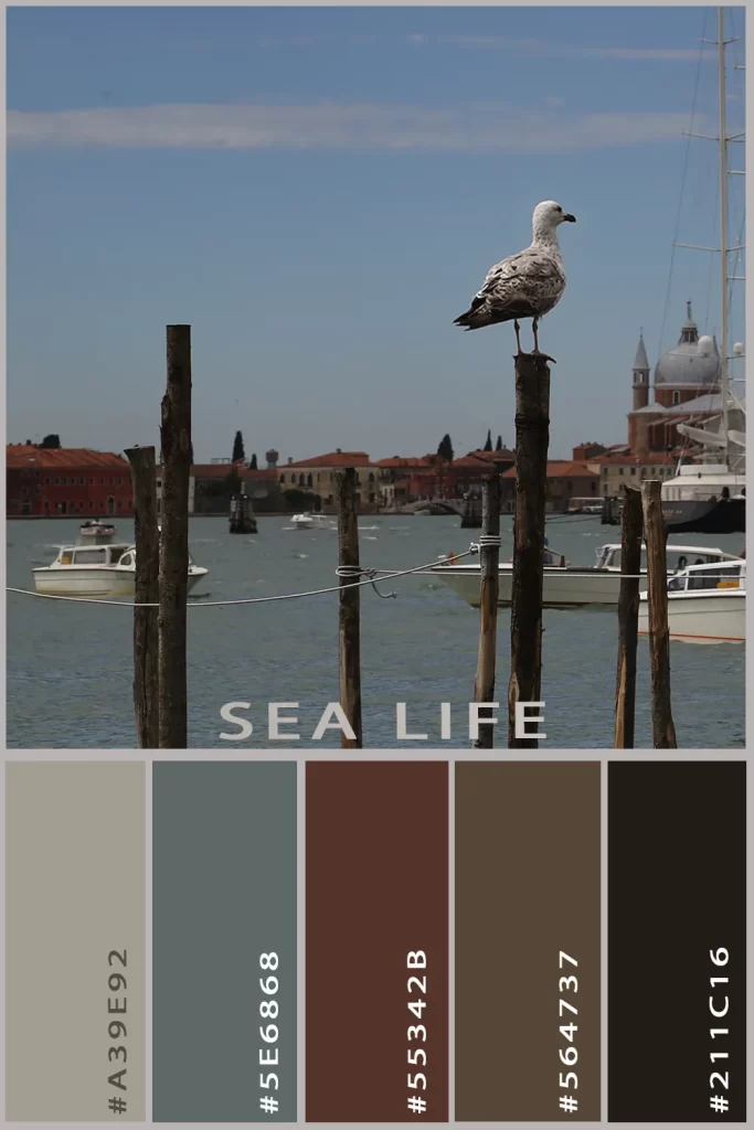
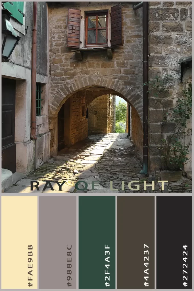
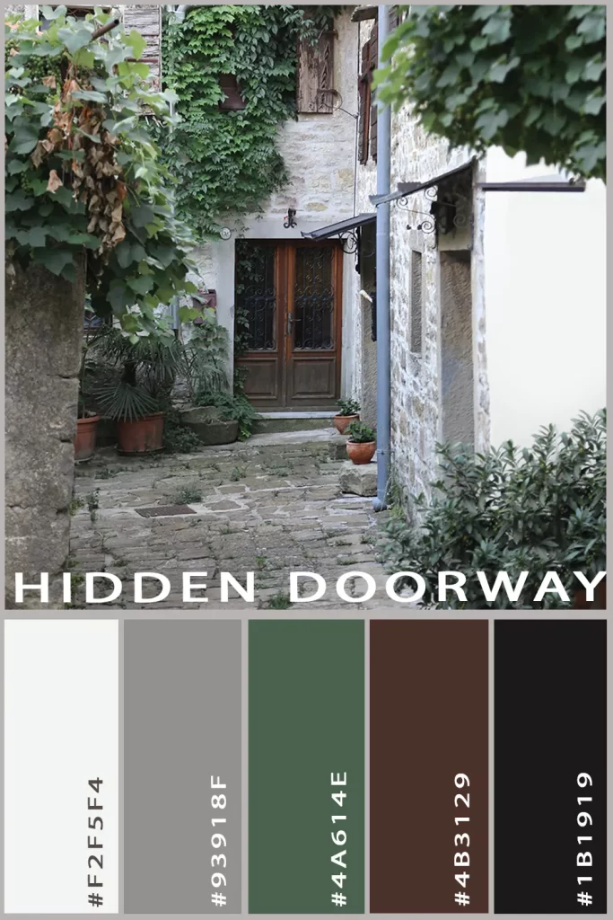
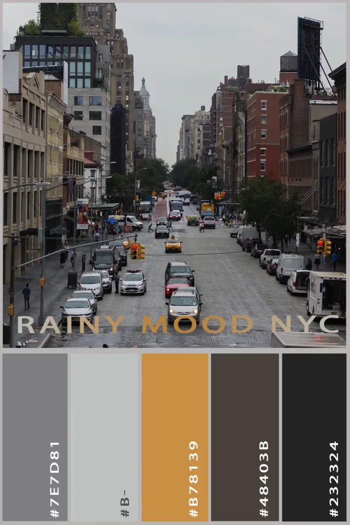
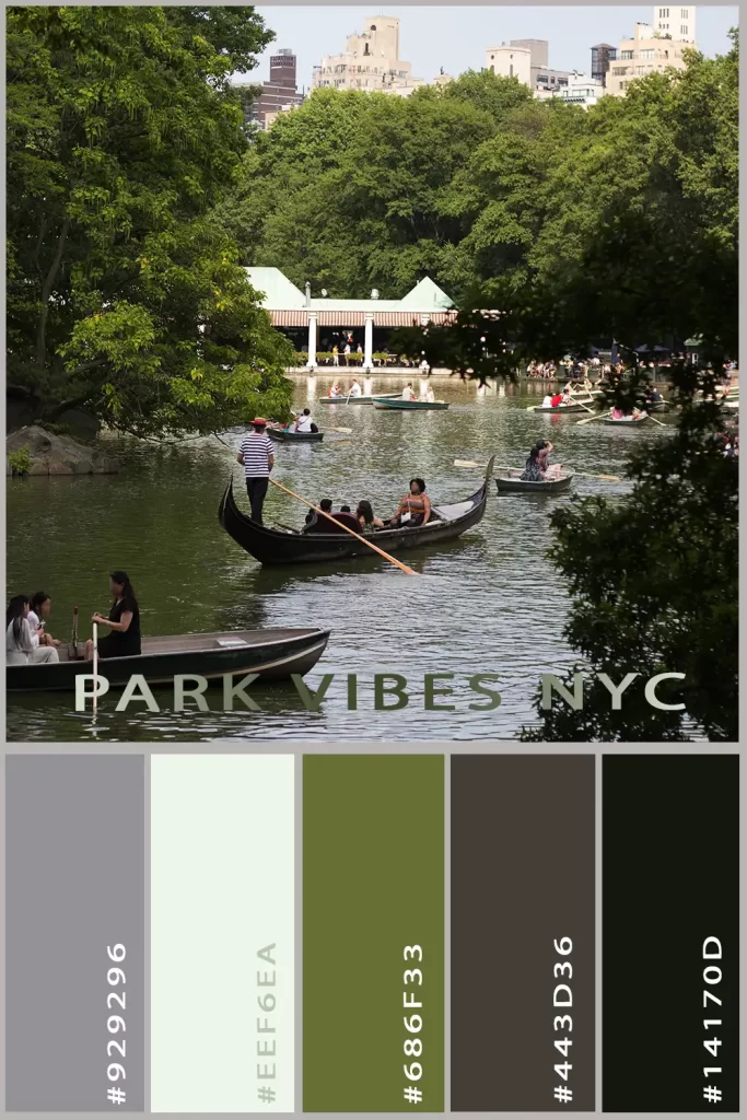
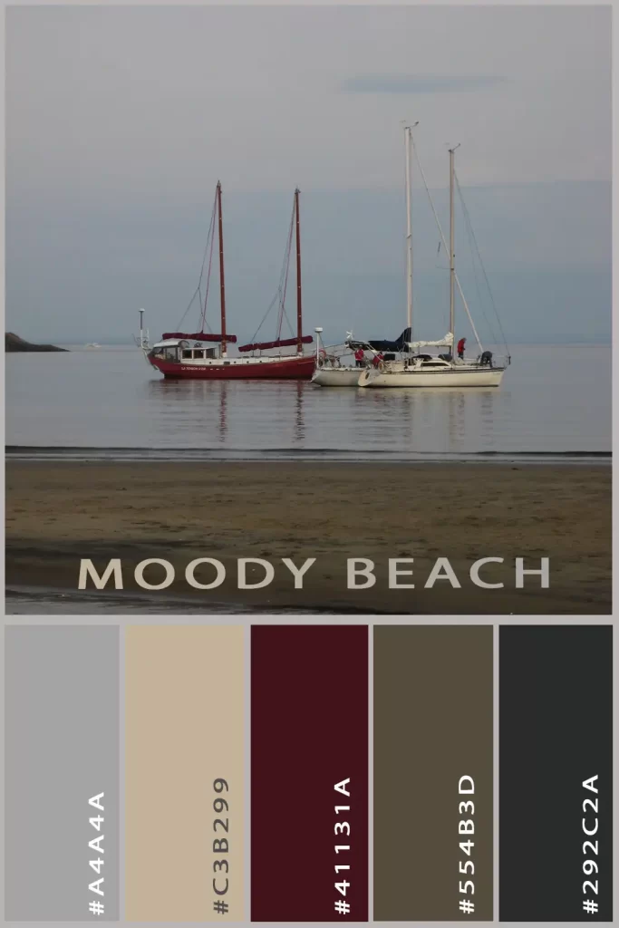
As a creator of different media and images, I understand the power of colors and how important it is to differentiate the light nuances, as well as the saturation, hue, brightness, etc., to create a beautiful image. As a photographer, I see my images often as canvases for different color palettes, with colors that can be used together, or separately to create an harmonious image.
Colors are the silent storytellers of design, communicating emotion, creating mood, and establishing visual identity before a single word is read. Crafting the perfect color palette is like composing a visual symphony – each hue carefully selected and balanced to create harmony, meaning, and impact.

A thoughtfully developed color palette does more than just look attractive. It:
- Establishes brand consistency across all visual communications
- Evokes specific emotional responses from your audience
- Creates visual hierarchy and guides the viewer's eye
- Ensures readability and accessibility
- Differentiates your brand from competitors


The art of color selection involves understanding color theory, psychological responses to different hues, and how colors interact with each other. It's not just about choosing colors you like, but about creating a strategic visual language that communicates your brand's personality, values, and message.

When designing a color palette, I consider:
- The emotional and psychological impact of each color
- How colors complement and contrast with each other
- The context of use (digital, print, environmental)
- Brand identity and target audience
- Accessibility and readability requirements